Sick of your mundane black or navy suit complete with a standard white shirt? Mix it up this season with some daring print mixing. If the thought of clashing prints triggers traumatic flashbacks to the 80s or simply committing a major fashion crime, it’s time to move out of your comfort zone and let the compliments roll in.
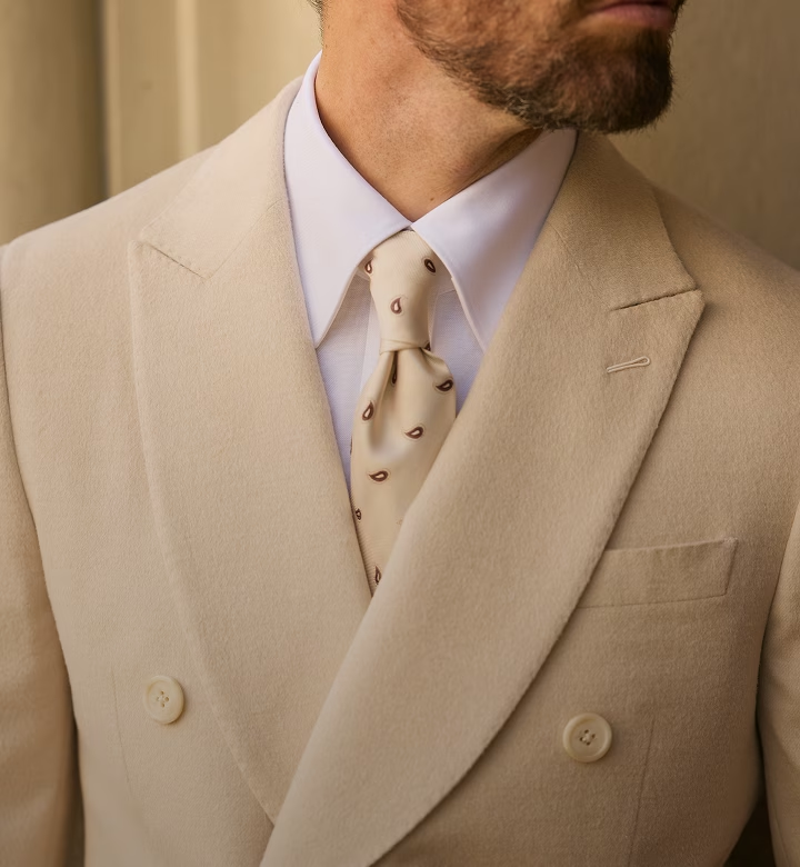
Running the risk of looking somewhere between a peacock and like a toddler randomly selected clothing items for you, print mixing is a fine art. As with all things in life, size definitely matters. Either choose one print to dominate and the others to act as accents, or clash the same print in varying sizes to avoid the patterns competing for your eye’s attention. Play it safe in the office with a small checked shirt contrasted with a large-shaped geometric print tie. Take a risk for your next weekend lunch and clash a paisley print shirt with a thin-striped tie.
For beginners, the biggest tip with colour is to keep it tonal. Keeping things within the same colour family (think navy with pale blue) allows you to mix stripes with checks to create a subtle yet bold look. For the more daring, don’t be afraid of mixing contrasting colours and complement warmer tones (browns, tans, reds, oranges) with cooler ones (blues, greys, purples, black). Look for the colours that are part of the supporting case of an ensemble. If there is a tan stripe in your jacket, try to use that tan as the dominant colour in your tie. Use these subtle undertones in the main piece of clothing and complement them with the accompanying shirt, tie or socks.
Ultimately, there are no hard and fast rules and practice makes perfect, but once you make a few trial runs, injecting some print clashes into your everyday wardrobe will be a breeze. Head in store for more advice or to update your wardrobe with fresh prints today!
Testimonials: Love Stories Told
Hear from couples who’ve lived the Luke Middlemiss experience. Their testimonials speak to the passion, dedication, and artistry Luke brings to each wedding, turning fleeting moments into lifetime memories.
Like:
Share:
Book Now
Happy with what you just read? We would love for you to experience our unique and personalised consulation process. Make a booking today with the below link or make an enquiry to learn more.